Many people get so indulged in writing an engaging subject line, perfect email copy, and adding visual elements that they forget that the ending matters too.
In email marketing, those endings are your email signatures that can become an ally in getting results. But, designing and creating a signature that gets you results can be tough. You need to consider many practices to see results.
So, this guide will discuss steps to design effective email signatures and best practices to follow.
Table of contents
- What is an email signature?
- How is an email signature different from an email footer?
- What constitutes a good email signature?
- How to design a professional email signature
- Email signature design ideas you can steal
- Email signature best practices
- Things you should avoid while designing an email signature
- It's time to design your email signature
What is an email signature?
An email signature appears at the end of your email where you thank the reader for their time and reflect the following:
- Personal and professional details: Your name, occupation, designation, and headshot.
- Contact details: Phone number, social media buttons.
- Actionables: Banners or CTAs.
Here is an example of how a signature look in an email:

How is an email signature different from an email footer?
The basic difference between an email signature and a footer lies in the sender of the emails.
An email signature is used when an employee, CEO, co-founder, or individual sends an email. It contains the name of the individual and the company's relevant details.
Email signature will look like this:

In contrast, an email footer is sent from a company's domain and contains information such as contact details, social media links, privacy policy, unsubscribe link, etc.
Email footer can look like this:

What constitutes a good email signature?
Dan Hanrahan, founder and CEO of Sigstr, said that,
"The best signatures are those requiring as little real estate, images, text, links, etc. to accomplish two goals:
Convey key information to learn more about you and your company.
Engage the recipient with a crisply designed and relevant campaign."
So, a good email signature will be easy to read and doesn't overburden recipients with loads of information. You want people to reach out to you, so make it easy for them to do so. Add your contact number and social media links. Success lies in simplicity.
How to design a professional email signature
Here are the steps you can follow to design the perfect email signature:
1. Gather the information and define your goals
As you sit down to create your signature, the first thing to decide is the goal you are trying to achieve via this particular signature?
For example, your goal can be to let people contact you or register for an event. Once you decide that, think about assets you will include. These are your logo/picture, links, banners, graphics, etc.
2. Experiment with different elements and create variations
Here, you will conduct experiments with different color palettes, font sizes, styles, and graphics and see which looks the most impactful and legible. This stage can take some time, and you must develop the best design to achieve your goals.
3. Putting the pieces together
It's time to put the pieces together that you finalized in the previous steps. As you begin, think about your signatures' format - file size and dimension. The recommended file size is 100kB, and the optimum dimensions of the entire email signature should be around 300–600 px wide and 150–200 px high.
Another crucial part is the arrangements of elements to create a visual hierarchy. It means the most important elements should come first and must be prominent. Additionally, the call to action (if any) should be distinguishable and recognizable to the recipient.
4. Review the signature and ask for feedback
Once you create your signature, you need to ensure that it looks good and serves its purpose. For this, you can ask for feedback from your co-workers or friends. It can give you a different perspective and suggestion to make your signature even more engaging and eye-catching.
Before sending, you should always test your email signature to ensure it looks good and renders properly.
You can use email generator tools like HubSpot email generator to design creative email signatures. But, you can create signatures on your own in Gmail and Outlook. Gmail and Outlook are the second most email clients, so having a professional signature can be helpful.
How to create an email signature in Gmail
Steps to create an email signature in Gmail:
Open Gmail webmail.
Then click Settings > See all settings.
Go to the "Signature" option. Then, if you want, you can format your message by adding an image or changing the font size, style, alignments, and adding links.
Once you are done, click Save Changes at the bottom of the page.
You can add up to 10,000 characters to your Gmail signature. Additionally, Gmail allows you to have multiple signatures in a single email account.
How to create an email signature in Outlook
Here are the steps to create an email signature in Outlook webmail:
First, go to Settings> View all Outlook settings at the bottom of the page.
Next, select Mail > Compose and reply.
Under Email signature, add your signature and use the formatting options to change and modify its appearance.
Note: You can have only one signature per email account.
- Then you'll see two different options:
Include signature automatically on new emails that you compose.
Include signatures automatically on emails you forward or reply to.
You can select accordingly. But, if you don't select any of these options, you can manually add your signature to a selected message.
- Select Save after you're done.
If you forget to add automatically to all email options, don't worry. You can add it later manually:
Go to your mailbox and draft an email.
Then, type your message and select More actions > Insert signature at the bottom of the compose pane.
When your email is ready, select Send.
Email signature design ideas you can steal
Here are some signature designs you can use:
1. Signature with no banners

2. Let the recipient know about rebranding

3. Promote your upcoming events

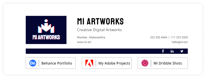
4. Add your portfolio links to your email signature

Email signature best practices
We have listed some best practices you should keep in mind while designing your signature:
✅ Make your signature simple and clean
The reader should be able to grasp and retain it easily. Avoid adding too much detail. A signature contains 3-5 lines.
✅ Make your signature responsive
Your email signature must be responsive for different devices such as mobile, tables, and desktops. Most signatures are optimized for desktops but create a campaign no wider than 295 pixels wide for mobile devices. Additionally, make your signatures that consider the maximum width of the device.
Related guide: How to Create Responsive Email Design For Better User Experience.
✅ Add a fallback version
If an email client supports HTML, they will also support email signatures. Bit If an email client doesn't support HTML but supports rich text, then having a fallback version becomes important. You can add compelling text to direct users to a landing page as your signature CTA.
Read more about HTML support across email clients: Can I email.
✅ Don't forget to include alt text if you add banners or CTA.
If you are using a banner as your CTA, you must add compelling alt text and entice users to take action if the image doesn't render.
✅ Make social media buttons looks good
To ensure the social buttons look good, use the following guidelines:
- Use a uniform file size for all social icons.
- Use a PNG or JPEG file format for maximum compatibility.
✅ Optimize email for dark mode
Use the following practices for making your signature stand out in dark mode:
Use an email generator to generate signatures that look good in dark mode.
Use transparent images for banners and headshots.
Add an outline to the icons if you add them to make them stand out.
Read in detail: A Complete Guide to Dark Mode Email Design and Campaigns.
✅ Test your signature before finalizing them
A/B test your email signatures by making variants based on font sizes, fonts, colors, CTA placements, social media links, etc. Then, you can test both versions and check which one performed better by email analytics. Usually, you would want to measure the open and click-through rate.
Things you should avoid while designing an email signature
Here are a few things you should avoid using:
• Inconsistent fonts and colors
Avoid too many font styles, sizes, and colors. An abundance of varying typography and shiny colors can make you look unprofessional and uncredible.
• Avoid inspirational quotes
Adding inspirational quotes may or may not resonate with the recipient. It might render useless and irrelevant if it doesn't fit the context. So, if you want to add a quote, be sure about the recipient. Otherwise, it's a best practice to avoid such quotes altogether.
• Avoid writing your life story in signatures
Your signatures are meant to inform the recipient about you and ways to contact you. You don't need to write your entire life story there. It will annoy the recipient. If you want to showcase your work, it's preferred to add your social links and portfolio link.
It's time to design your email signature
So, it's time to put what you've learned into practice and create an email signature to awe your recipients. Just remember email signatures shows who you are and what sets you apart. Use them to reflect that and make a great impression.

