"You never get a second chance to make a good first impression." - Will Rogers
Email headers are the key to making a great first impression on your subscribers because it's the first element they see when they open your email.
It can entice people and compel them to scroll down and check out the entire email when it is designed well. So, you must make the most out of this component by making the right impression and capturing your readers' attention.
Don't fret if you have no clue what they are or how to use them. We have put together this guide to tell you everything about designing email headers.
Note: We will discuss the design aspect of an email header in this article, not the technical aspect. Check out this guide to know about the technical version of email headers.
Table of contents
What are email headers?
Usually, the email header is the top of the email containing information about the subject line, sender, and recipient. But, in email marketing, the HTML header is referred to as the email header when designing an email. The main body and email footer come after the header.
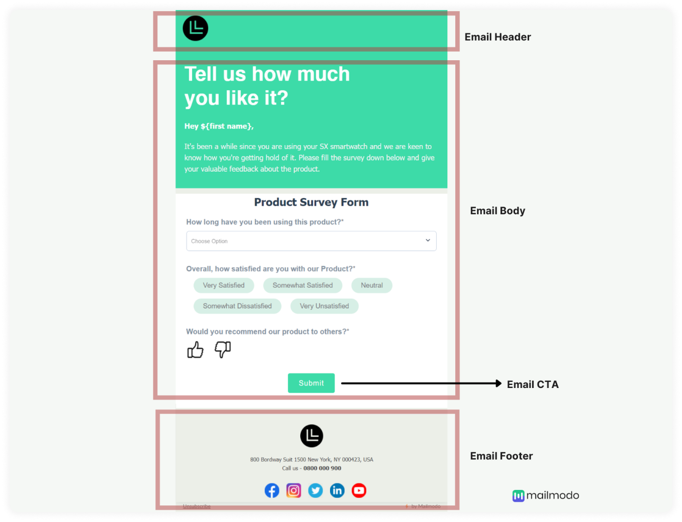
The HTML header would usually contain the company's name, logo, or even a line about some discount or free shipping offered.
Here in the example below, Mailmodo has put their logo in the header and an option to invite a friend.
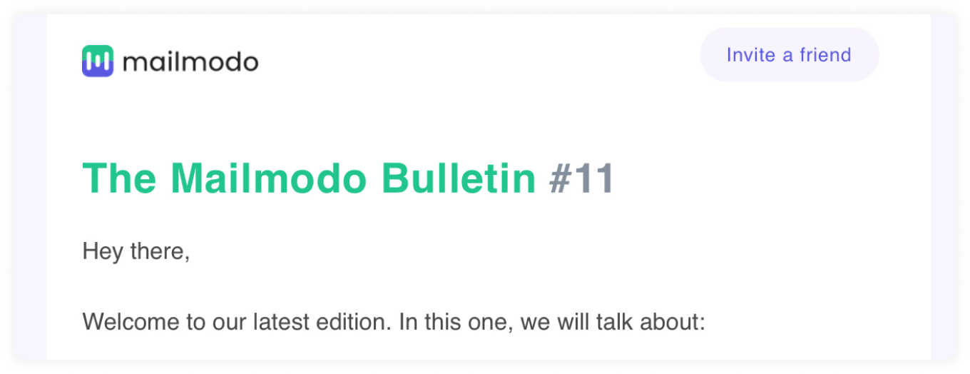
It's a great space for you to insert your branding or marketing. But unfortunately, most marketers overlook the header and do not spend much time optimizing it to its full potential.
Note: People normally confuse email headers with email preheaders. Email preheader is the text shown below or next to the email subject line in the inbox, while email headers are the beginning portion of the HTML email.
How to create great email headers?
Now that you know what it is let me tell you that if you use it effectively, it can create a good impression on your users and showcase your brand identity.
Here are some ideas and tips you can keep in mind when designing your email header.
1. Put in your logo
By placing your logo in your email header, you incorporate branding in the email. The logo helps with brand recognition and makes people want to read it because it's from a known source.
Use a transparent PNG of your logo in the header. That way, it'll look good in dark mode. Most brands add the logo in the center of the email. But you can also add it to the left side of the email because people usually read from left to right.
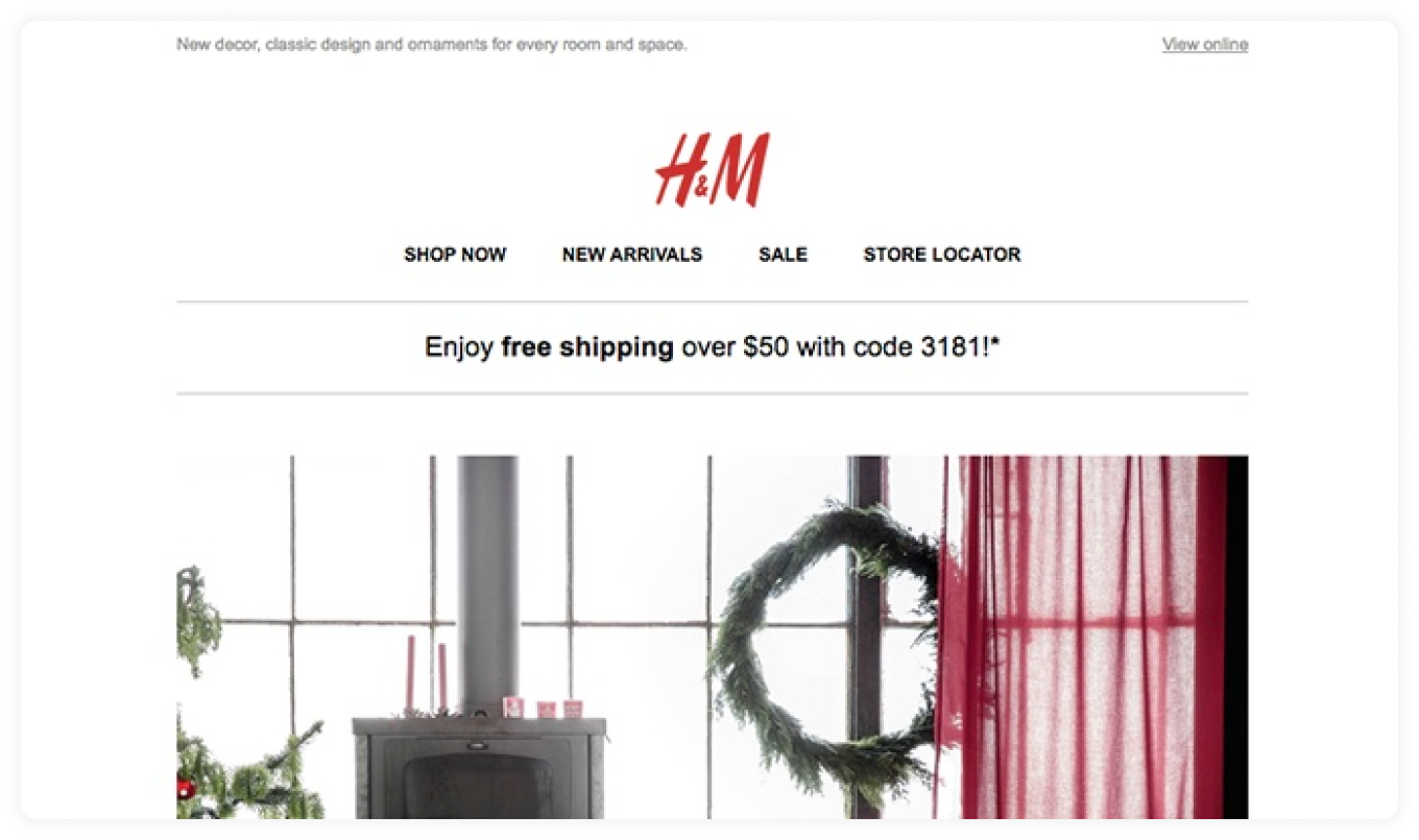
Source: Really Good Emails
2. Add a "View in browser"/"Web version" option
Sometimes, the email may not load fast or load at all; in that case, you need to give people an option to view it somewhere else, like on the browser.
Most people provide the view in browser option in the footer of the email. But we would suggest that you also provide the option in the header so that they don't have to scroll down and search for it.
 Source: Really Good Emails
3. Provide a navigational menu
You can provide an interactive menu to help your customers navigate through the email and lead them to your website. Many eCommerce companies use this menu to help reduce clutter in the email and make it easy for people to discover what they are looking for.
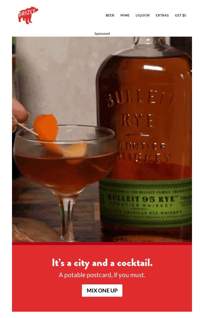 Source: Really Good Emails
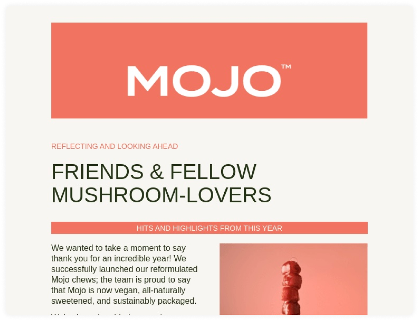
4. Use a colorful header background
Color is another way to capture your reader's attention, apart from using GIFs or animated logos. You can use one of your brand colors or something that complements it to add a pop of color to your email.
Here, Mojo has used their signature brand color as the background color in the header behind their logo.
Source: Really Good Emails
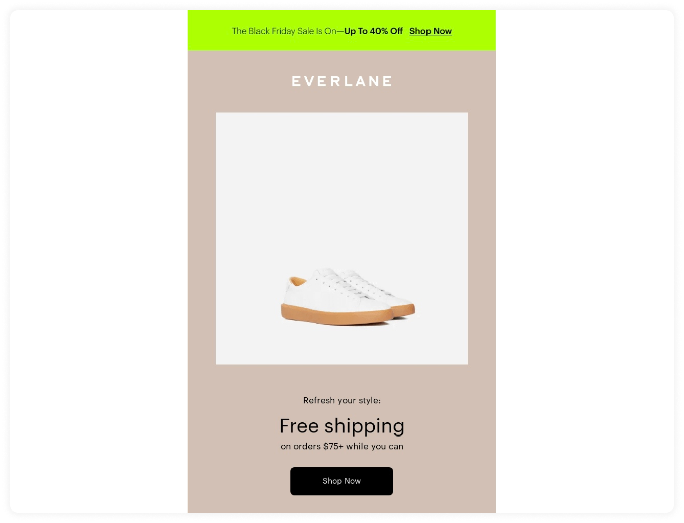
5. Write about the discount or free shipping
If you offer any discounts or free shipping, you can mention it in the header as it will motivate the users to scroll down to see more about the offer.
For example, Everlane has utilized the header space to announce a Black Friday sale of up to 40%. They have used a bright green background to grab your attention, and they tell you more about the offer in the body of the email.
Source: Really Good Emails
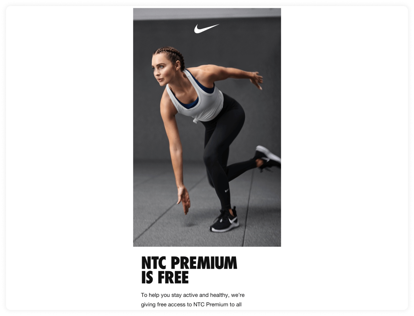
6. Try using no header at all
Contradicting? Yes!
But it can work when done right.
The point of the header is to utilize space and promote your brand, and you can also do this without having a separate header block.
Nike is a well-known brand with an iconic logo, and they know it. So, they use just a logo in their email on top of the image without a separate branding header.
Source: Really Good Emails
7. Use your brand mascot in the email header
If you have a mascot or character for your brand, the email header is one of the key places to add it to the email. People are always fond of characters and mascots. So, by including them in the header, you positively impact the readers, and they want to know more about what your cute mascot has to say.

Source: Really Good Emails
8. Use an animated logo to spice up boring email headers
If you have already added your logo to the header, try adding an animated version of your logo. The animated version makes the headers more interesting to look at and captures your reader's attention. Make sure your GIF or logo's image size is less than 1MB so that it'll load fast even when it's viewed on a mobile device.
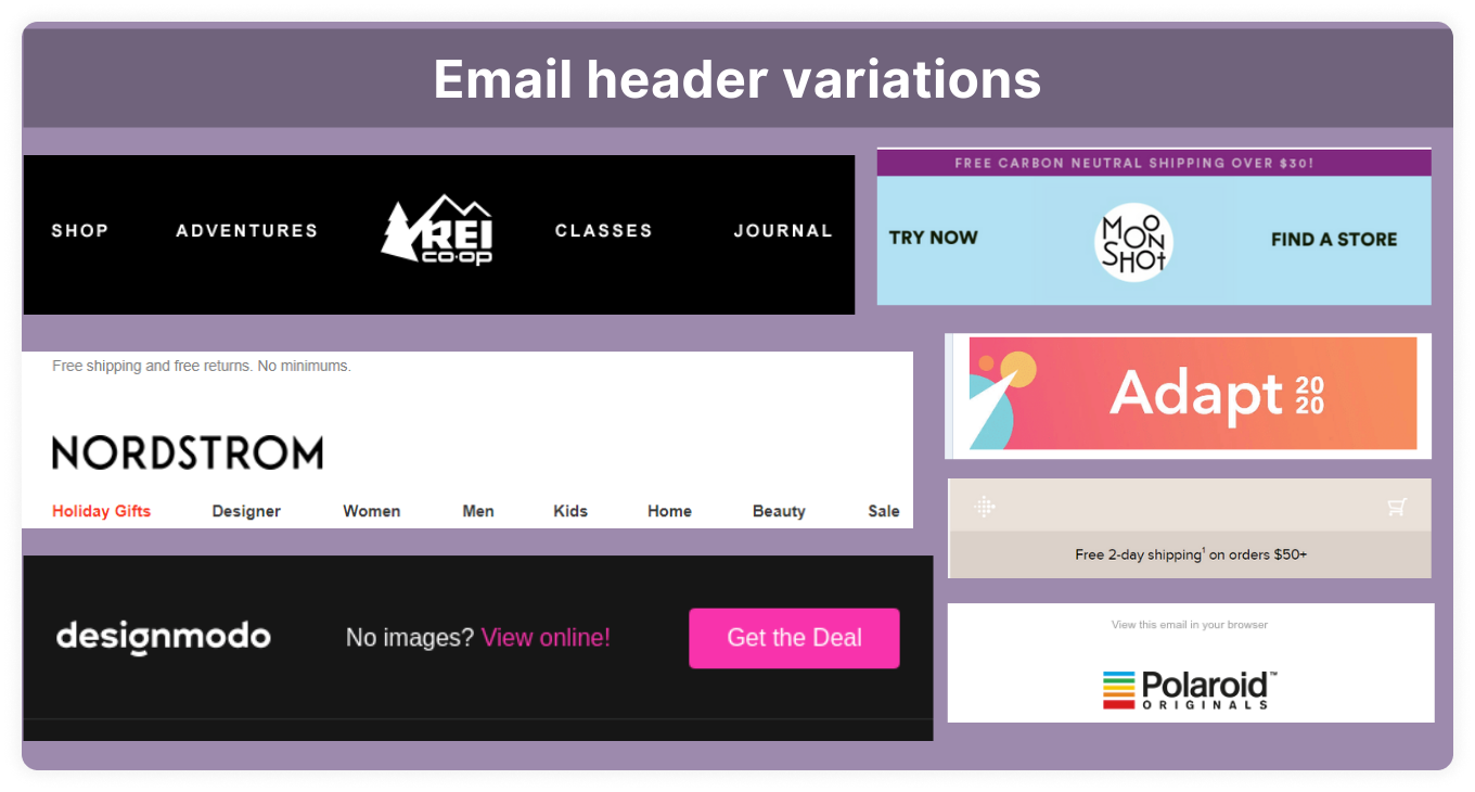
9. Create variations of the email header
Now, you know the different things you can include in a header. We recommend that you create a few different header variations that you can use for different types of emails that you send. Having pre-made templates reduces the time spent creating a new one from scratch every time you create an email campaign.
How to design email headers in Mailmodo?
If you plan to use Mailmodo to create your email template, here are the steps to create your email header:
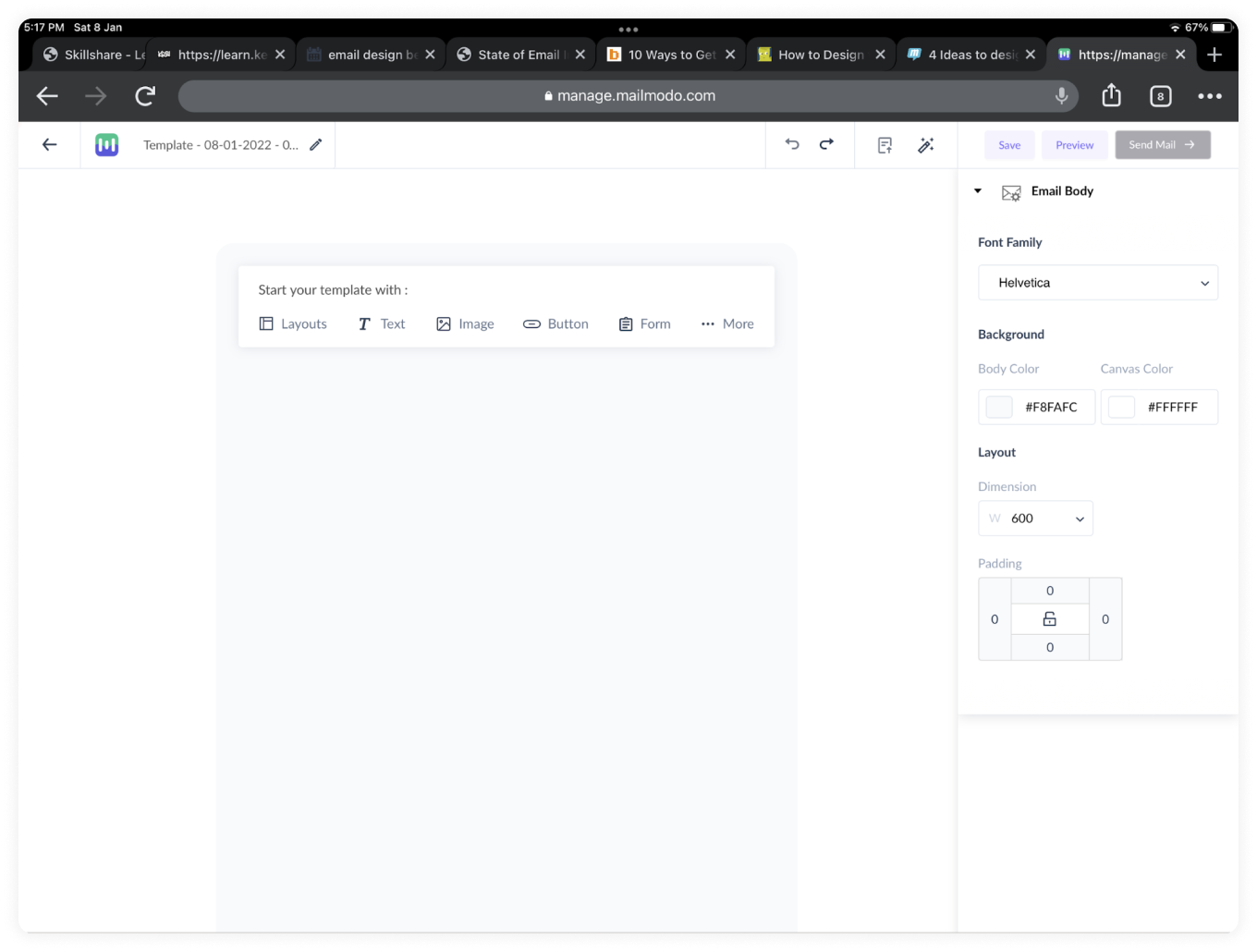
- Log in and click on templates and either select a pre-made template or create a new one. If you select a new template, this window will appear 👇
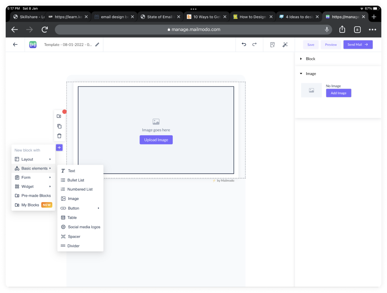
- You can add logos or images and customize the text according to what suits your brand identity. Or, you can utilize one of the pre-made blocks they provide and customize it to suit your needs.
To access the pre-made blocks, go to ➕ symbol and click on "pre-made blocks."
- Then click on the "headers" section and you will see will a few pre-made header options that you can use in your email.
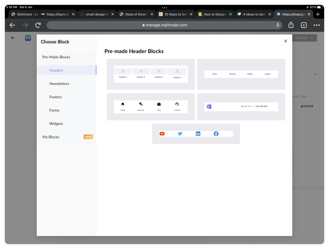
Customize it with your logo, colors, text, and you are all set to create the rest of your email. Mailmodo makes it easy to create your email templates with their drag and drop editor that enables you to create beautiful emails in a short period.
They also have a massive library of templates that you can choose from, so you don't have to create everything from scratch. If you want to try it out, sign up for free, play around with it, and see what you are looking for.


