Email design is like interior design.
How? Let me tell you.
We have all wanted to design beautiful, Pinterest-worthy interiors for our homes. But it also has to be practical and functional.
Similarly, a well-designed email is not just about visual appeal; it has to be functional and help you connect with your audience, sell them your products, and improve your email marketing ROI. But, creating a promising email design is difficult, and there are many components of an email that have to be designed appropriately to get favorable results.
In this guide, we talk about some email design best practices covering all the different components of an email.
1. Make sure your email design is on-brand
Keep the colors and fonts used in the email cohesive with the brand's visual identity. This means your imagery, colors, logo, font, and CTA button have to be consistent with your website and social media.
You enable readers to develop more brand awareness by keeping the emails cohesive with your brand's visual identity. According to a report by Reboot, brand recognition can be increased by 80% if the brand uses a signature color.
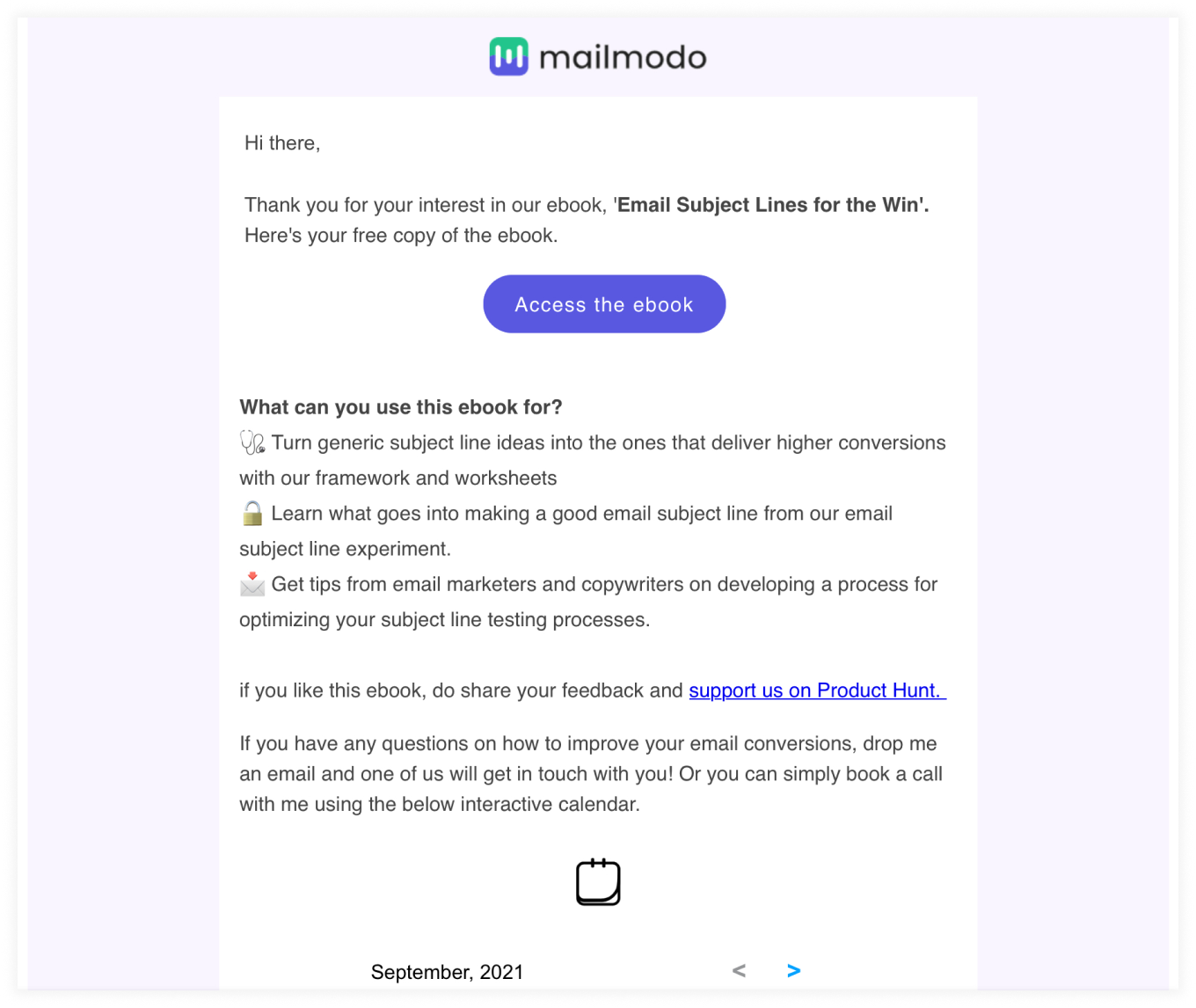
Here, Mailmodo creates emails with their signature color palette and has a consistent design that matches their brand.
2. Know your recipients' email clients
It's crucial to know how different clients render emails. Know the main workarounds from client to client so you have less difficulty developing an email and dealing with problematic clients.
When developing an email, keep in mind the distribution of email clients across the list you are sending to. Avoid spending time developing for difficult clients that have small user bases and instead for one the ones with the largest user bases. Build for older less capable clients first, then enhance to provide more features for newer clients who can handle them.
3. Personalize your emails with dynamic content
In a survey conducted by SmarterHQ, it was found that almost 72% of consumers online engage with content only if they are personalized and are related to their interests or needs.
Dynamic content is a way to take personalization to the next level. It is when you change entire portions of your email content to make the email campaign more relatable and appealing to the recipients.
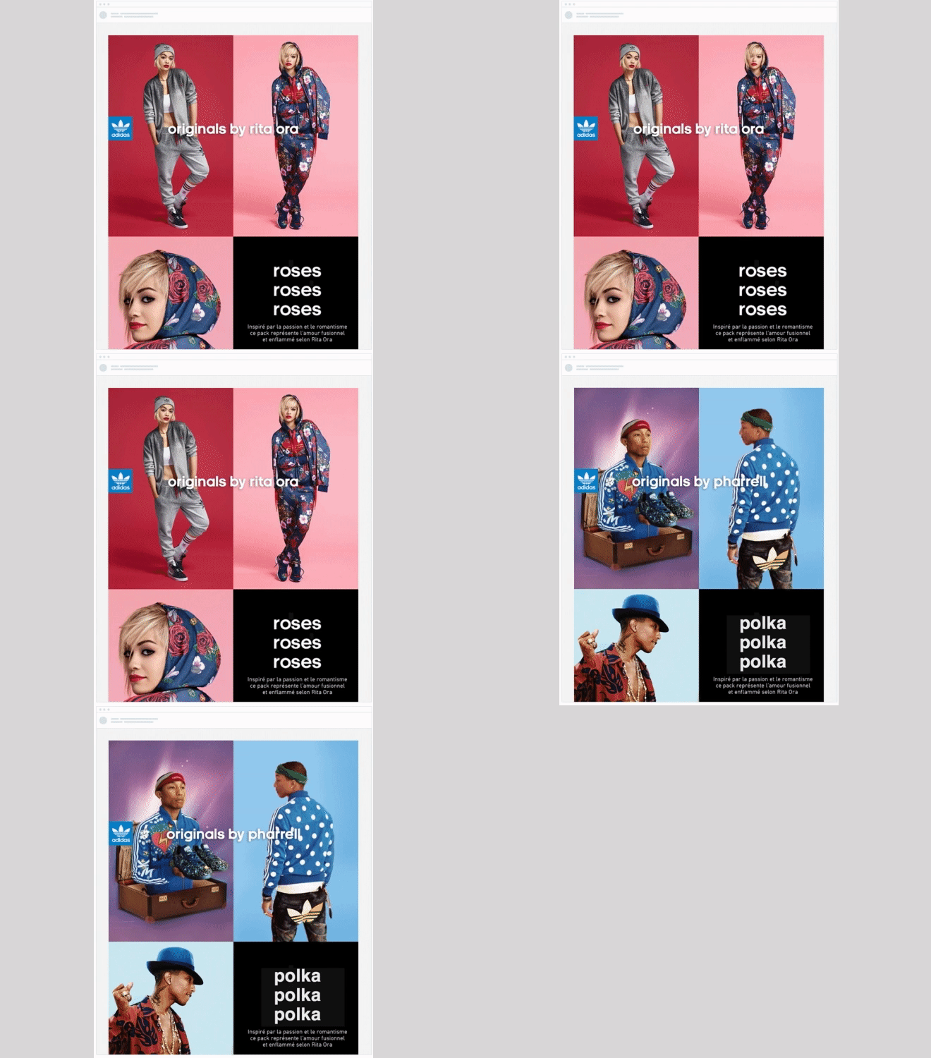
The more you know your subscribers, the more targeted, relevant, and customized your emails can be. For example, in this email campaign, Adidas shows their men's products to the male subscribers while showing the women's products to female subscribers.
Source: Campaign monitor
4. Choose an appropriate email layout
A poorly structured email can make it difficult for users to read and understand your emails. The structure helps you to prioritize which content you want to include in the email.
For example, if you are sending an email to promote your product, but you put the photos below the text, then it won't make sense to the readers. However, if you started the email by showcasing the picture followed by a description and CTA button, it would provide better conversion.
Also, a single-column email can be easier to read and more responsive across devices. It's up to you to choose what type of layout is appropriate for your email. It can be an inverted pyramid layout, zigzag layout, or even a two-column layout.
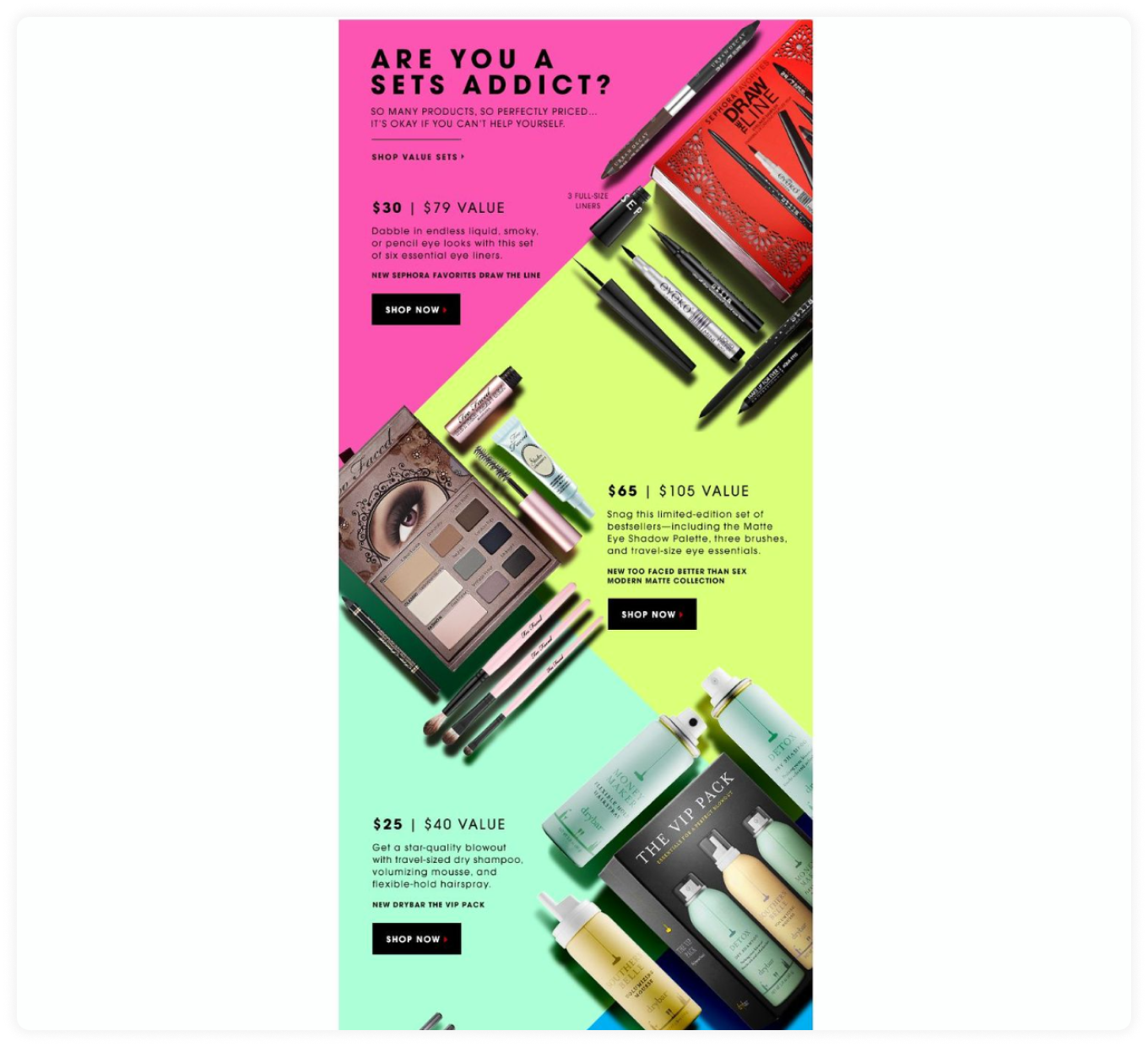
If you are choosing a more complex layout, make sure to thoroughly test the emails across devices to prevent any possible responsiveness issues. Here is an example of a zigzag email layout. The layout makes your eyes travel through the email and shows you clearly what to focus on. You can use this layout to change things up and keep your emails interesting.
Source: Campaign monitor
5. Write a clear email copy
When you are writing the email copy make sure to keep it short for better readability. People should understand what you are talking about by reading the first sentence.
Make sure to use one or a maximum of two fonts when you write the email. This helps keep the email cohesive and readable. If you use web fonts, have a few system fonts set as default if the email client cannot show your font.
6. Avoid sending all-image emails
Avoid sending emails that contain only images. It's a bad practice that leaves readers confused if the images fail to load for any reason. Also, it makes the emails not accessible for people who have disabilities and use screen readers.
Try to keep the image-to-text ratio at 40:60 and avoid image-based text. If you can't, then provide a fallback with alt text so the email is still clear if the images don’t load.
An email with a width of 600-640 px is optimal to make sure it looks good on all devices. So keep it in mind when adding images and creating the template.
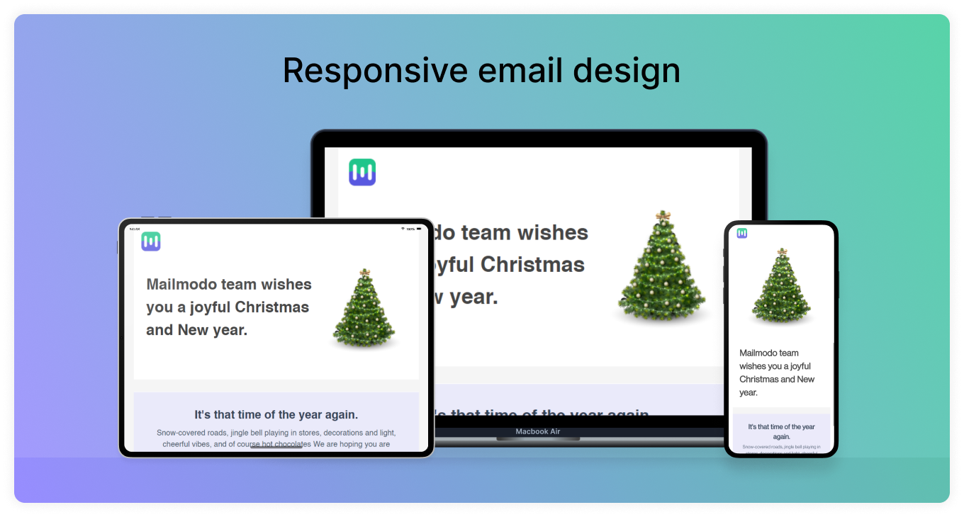
7. Optimize the email design to be responsive for all devices
People usually check their emails on the phone when they are not using a laptop. So you need to design emails that are responsive regardless of the device. To make your email design responsive, keep the copy of the email short and legible so people can read it on the go.
You can also design it in a way that the links and CTAs are within thumb reach. If your message is lengthy, consider repeating the primary CTA at the end of the copy to save your reader's scrolling time.
8. White space
White space is the space around your sentences, images, and CTA buttons. It is a crucial component of design. It helps separate elements visually from other elements in your email.
It also helps increase the legibility of your email and improves the reader’s ability to look over the email as a whole. Make sure your email copy and CTA button are separated, but close enough to know they’re related.
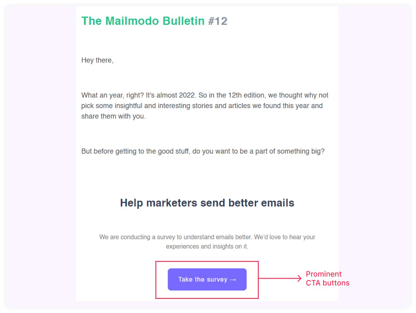
9. Prominent CTA buttons
Use distinct color and whitespace around the call-to-action button such that the viewer can easily see and click on it.
You can use the CTA in the header or also at the end of the email; it depends on how long the email is.
10. Use GIFs rather than videos
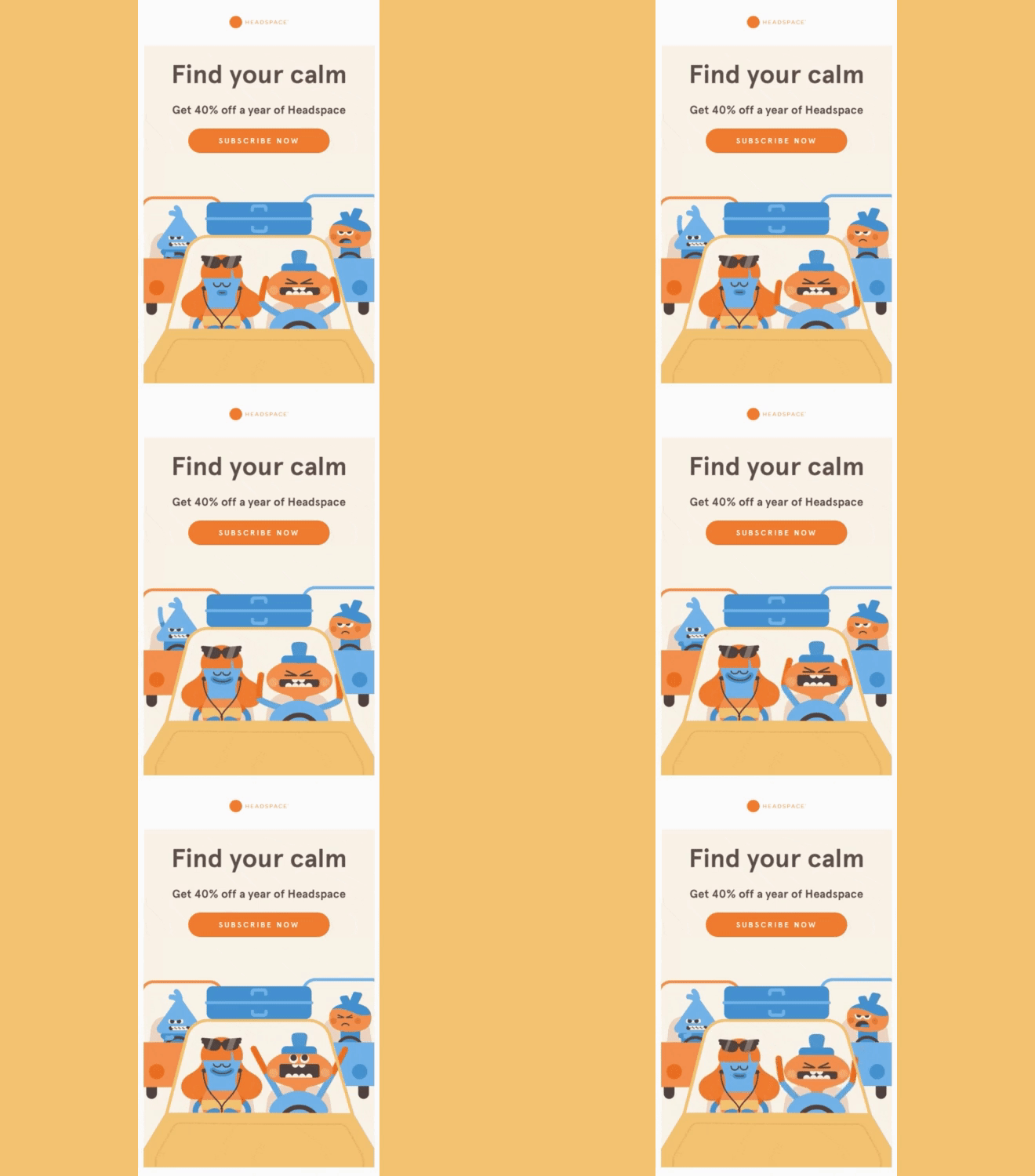
When you have a choice between video and GIFs, always choose GIFs. Because only a few email clients allow embedded videos you are more likely to end up in the spam.
So it's better to use GIFs in the email instead of videos as they are short, expressive, and take less time to load. Make sure the GIF you use is compressed and is not a large file; this will help with the deliverability.
Source: Send in blue
11. Design optimal footer
- Unsubscribe link
If people can’t find a place to unsubscribe from your emails, they’re likely to mark your emails as spam. Design your unsubscribe link to be more visible. You might lose some subscribers, but you will also lose some spam reports.
- Social media
You can link your socials in the footer of the email to give your audience access to more of your content. Choose and link the relevant and most frequently used social media platform by your organization.
- Support
Provide ‘contact us’, a reply email address, or support links. It shows that your brand focuses on customer support and encourages subscribers to speak up about their problems.
12. A/b testing
Testing emails is an iterative process. It means you will have to continuously test and retest to make sure your emails are rendering correctly.
You can test several components like CTAs, responsiveness, layout, etc, and see how people engage with different versions of the same content.
13. Dark mode
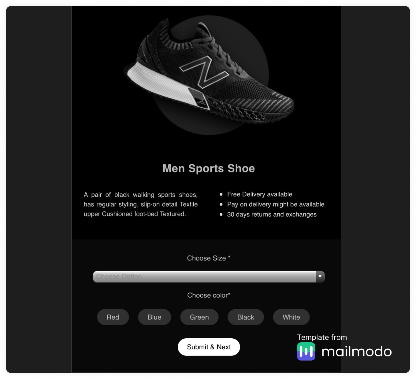
Almost 80% of people use dark mode on their devices. So it's important your email design work well with it.
Make sure that the font is shifting to a light color on the dark background and that all the visual components are properly visible for a dark or light background.
Check out our article "A Complete Guide to Dark Mode Email Design and Campaigns," to know more on how you can optimize your emails for dark mode.
14. Keep the overall email design minimal
When you go over the final review of the email, make sure you remove any redundant or unnecessary information or design element. When designing the email stick to the concept of less is more as a long and cluttered email only discourages the readers from taking time to read your content.
Wrapping up
To design an effective email, you can follow the tips mentioned above. While it's completely fine to create a design and stick to it, it can be a good idea to change things up in either the design or content to perk your readers’ interest every once in a while.
If you are just starting with email design and you don't want to create a template from scratch then you can use email service providers like Mailmodo. Mailmodo provides a lot of templates for you to choose from, and you can do everything from creating, testing, and sending out the emails in Mailmodo itself.
Sign up for Mailmodo today!


