Have you ever received an email where you couldn’t read the text due to low color contrast? Or even with alt text, the information was not clear? What did you do with that email? We are sure you closed it and moved to the next email.
Imagine if your subscribers are giving such cold-shoulder treatments to your email because your emails are not accessible. This issue becomes worse when you consider real-life problems. For instance, many users might have physical impairments like visual, auditory, or even color-blindness.
How will you resolve them? You can resolve these by designing and creating emails that are accessible. But how do you figure out email accessibility?
Well, this guide will tell you everything about email accessibility and how to implement it. We will also discuss the best practices for email accessibility with a deep dive into different conditions to consider.
Table of contents
- What is email accessibility?
- Why does email accessibility matter?
- Why should you create accessible emails?
- Which conditions should you consider for email accessibility?
- How to make emails accessible?
- How to make email design accessible?
- How to make email code accessible?
- One step up - How to aim for more than just accessible emails?
- Few more actionable tips to make email accessible for all
- Way forward
What is email accessibility?
Email accessibility is the practice of ensuring that your emails can be read and understood even by subscribers who are disabled. Email accessibility also becomes relevant when certain portions of the email become inaccessible due to technical compatibility issues.
For instance, Links in emails are displayed as blue, but users who can't perceive the blue color might not know where to click. In that case, you must make the link distinguishable by underlining it or using a different typeface.
On the technical side, Outlook (web) doesn’t support AMP for emails, but the Gmail Android app does. So, if you send AMP emails without a fallback version to outlook users, they won’t access your emails.
Why does email accessibility matter?
Email accessibility matters because a large proportion of users live with some sort of disability
There are chances that your users might have some sort of disability you may not be aware of. Here are some statistics related to the number of people with such disabilities:
According to the WHO, over one billion people live with some form of disability.
Globally, at least 2.2 billion people have a near or distant vision impairment.
Color blindness affects approximately 1 in 12 men (8%) and 1 in 200 women (0.5%).
An estimated 15% of people have dyslexia which means they have trouble reading.
By 2050 nearly 2.5 billion people are projected to have some degree of hearing loss, and at least 700 will need hearing rehabilitation.
These statistics show that a large proportion of people have some kind of disability. And if your emails are not accessible, you are losing such users and creating a poor email experience for them.
Why should you create accessible emails?
As an email marketer, making email accessible should be at the core of your marketing strategy. Such accessibility can be helpful for your organization’s growth and give users a better email experience. Besides, there are the following reasons for creating accessible emails:
• It’s the human thing to do - Design for all
Ensuring email accessibility is the most human thing to do. Emails with high color contrast, legible fonts, descriptive CTAs, etc., will benefit everyone.
• It helps you reach more users
With accessible emails, you will reach more subscribers - users with disabilities and limited email client support.
• It improves the trust and credibility of your organization
Your audience is at the core of your marketing strategy. By focusing on your audience, you make sure they can read and access emails without any problem. Such understanding makes them feel heard and valued, enhancing trust and credibility.
• It makes you stand out from your competition
Email accessibility is still an up-and-coming topic, and its awareness is lacking in many industries. There are high possibilities that your competitors are not focusing on making emails accessible for all. So, it gives you a way to stand out and be recognized as a more empathetic brand.
• It helps maintain your reputation by minimizing legal risk
The World Wide Web Consortium (W3C), an international standards organization, has formed the Web Content Accessibility Guidelines (WCAG). It is the go-to document for global accessibility standards. It includes text, images, code, or markup that defines the structure, presentation, etc.
Any lawsuit or penalty by WCAG can damage your reputation. So, by following the accessibility guidelines, you can steer clear of legal risks and maintain your organization’s reputation.
So, ensuring email accessibility can be beneficial in many ways, but before creating such emails, you should be familiar with the conditions your users might be facing. Let’s discuss them first.
Which conditions should you consider for email accessibility?
There are two different conditions to consider while creating accessible emails:
- Human disabilities
- Technical compatibility and support issues
1. Human disabilities
Your users might have different disabilities which affect how they access and engage with your emails. If your emails are not accessible for people with such disabilities, then chances are they might get frustrated and annoyed. So, you should understand these disabilities to create accessible emails. Major human disabilities you should know about are:
- Vision impairment
It refers to loss of vision or sensitivity to color or brightness. Such individuals use screen readers and keyboard commands to navigate through the email content. These devices depend on semantic code, which helps screen readers distinguish between the email’s design and textual content.
- Motor disabilities
Motor disabilities such as hand tremors, lack of coordination, broken arms, and paralysis make it difficult to scroll through the email. If users cannot click on buttons and links in the email, how will they take the next step? Hence, marketers should consider creating big buttons and links.
- Cognitive and neurological disorders
Any impairment in the brain affects its processing ability. That’s why it is a best practice not to overwhelm your users with too much information. Hence, use enough white space, shorter paragraphs, and not too many animations and GIFs.
- Hearing impairments
People with auditory disorders are either deaf or find it difficult to differentiate the sound of the words. In the latter case, people don’t understand a sentence in the usual manner. Thus, if you are adding a video or audio link, make sure to add captions and transcriptions.
2. Technical compatibility and support issues
Some technicalities can alter your email code, and emails may get displayed in an unintended manner. These technicalities are related to email client support, browsers, and devices on which your email is being viewed.
- Email client support
There are 50+ email clients having different rendering criteria. Most clients use some kind of preprocessor that will modify your code. So, chances are your email elements, or code may get stripped out or blocked by these email clients.
So, analyzing the email clients' support is imperative to create accessible emails.
- The browser and Operating system
There are different browsers and Operating systems your subscribers use to view your emails.
For instance, some might be using iOS mail and others Apple mail. Each of these browsers and OS has a different configuration, and chances are your email might be displayed differently on different browsers and operating systems.
So, you must understand the browsers and OS usage and create emails accordingly.
- Devices
As per statistics, 42.4% of users view emails on mobile while 16.4% view them on desktop. It means the width size varies as per device, and an email might look well on a mobile screen but may be difficult to read on the desktop. So, ensuring that emails are displayed uniformly is crucial despite the device they are using.
Now that we have covered the conditions you should consider for email accessibility, let’s discuss creating and ensuring accessibility in your emails.
Related guide: 11 Must-Know Tips to Optimize Emails For Mobile Users
How to make emails accessible?
When we talk about emails, two things come into play - the email design and the email code. You need to make both of them accessible to your subscribers.
How to make email design accessible?
Here are email design best practices to create more accessible emails:
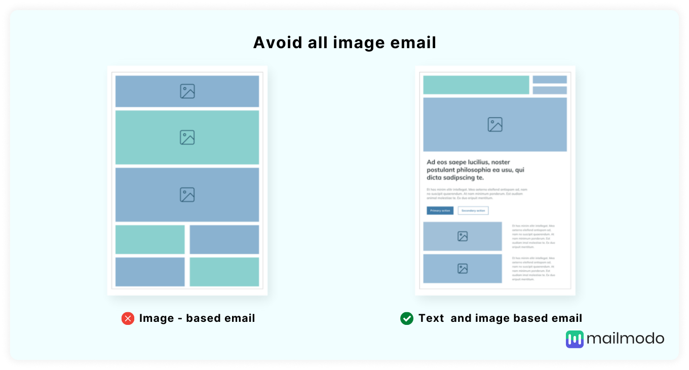
1. Avoid all image emails
Taking an image and dumping it into an email is not a practice we recommend. Some email clients block images by default, and you cannot describe the entire image with alt text. Can you? Besides, the screen reader will read the alt-text, not decipher the image.
So, don’t make your emails an infographic, to put it loosely. Instead, use text-based emails while maintaining the image-to-text ratios of 80:20.
2. Keep email layout simple
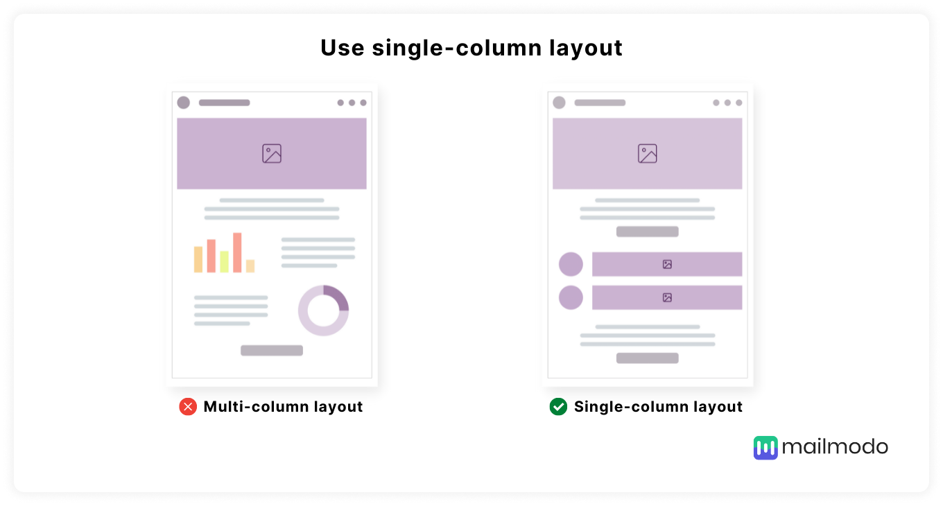
A simple email layout is essential to reduce sensory overload for users with disabilities. If an email has too many images, tables, columns, and links, it can burden the reader.
For this reason, a single-column layout is preferable as it makes content and functionality easier to locate and identify by users. Moreover, content became more usable for users with mobile devices.
3. Left-align email text
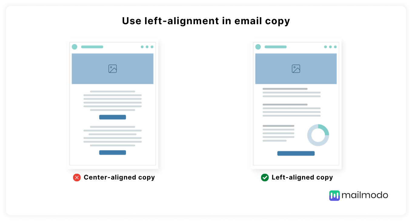
People with dyslexia prefer the left-aligned text to be centrally aligned because left alignment maintains the consistent character and word spacing. Thus, a best practice is to left-align the copy if any paragraph is longer than two lines.
4. Use legible typography
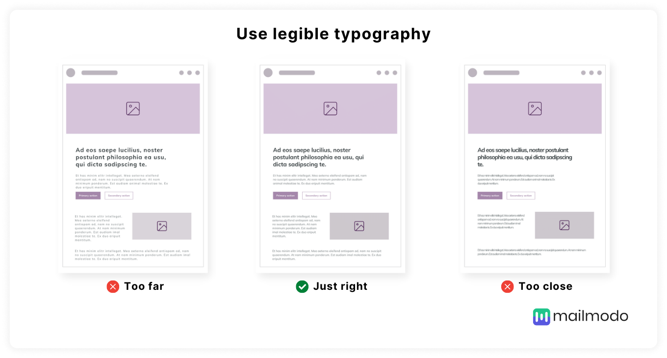
Typography includes font family, size, color, height, etc. Using appropriate typography is crucial as smaller fonts, etc., can make reading emails difficult. Follow these best practices to ensure legibility:
Use evenly spaced font types such as Sans-Serif font.
Use appropriate font size so that it is readable regardless of the user’s screen size and disability. For example, the headlines of 18 px and the body copy of 16px are preferable.
For emphasis, increase the font size instead of capitalizing it.
Adjust the letter-spacing as too condensed fonts can be challenging to read.
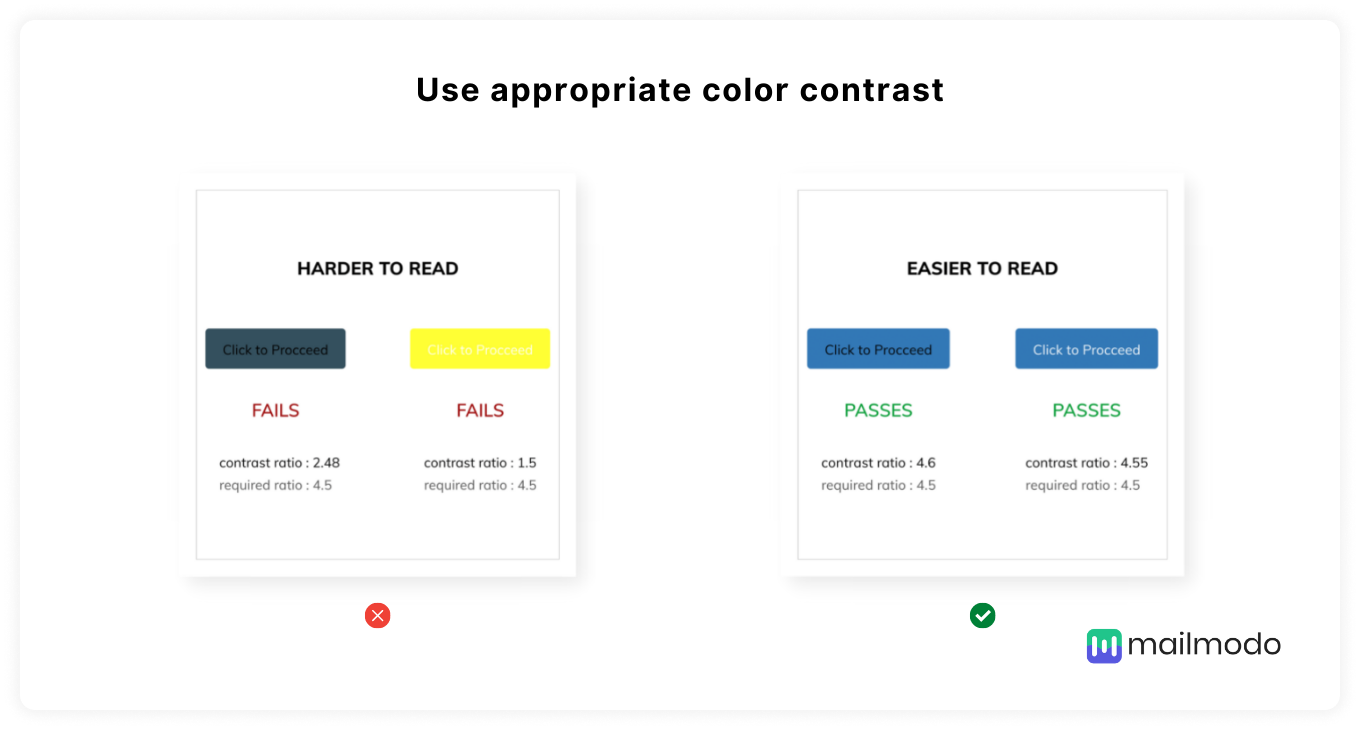
5. Use appropriate color contrast
The color contrast refers to the difference between the background color and foreground color. Lower color contrast can make it difficult for people with vision impairment to read.
As per WCAG, for standard-sized text, use a contrast ratio of at least 4.5:1. With font size larger than 23px or bold text larger than 18px, the ratio should be at least 3:1.
6.Use enough white space/breathing space
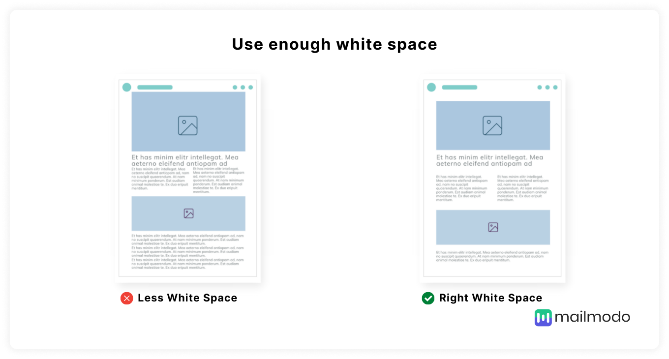
Do not include all email elements such as images, graphics, text too close to each other. It can be hard to access these elements, especially those using screen readers or keyword navigation tools.
So, keep enough white space around email elements so users can easily understand them.
7. Make links and buttons distinguishable from other email elements
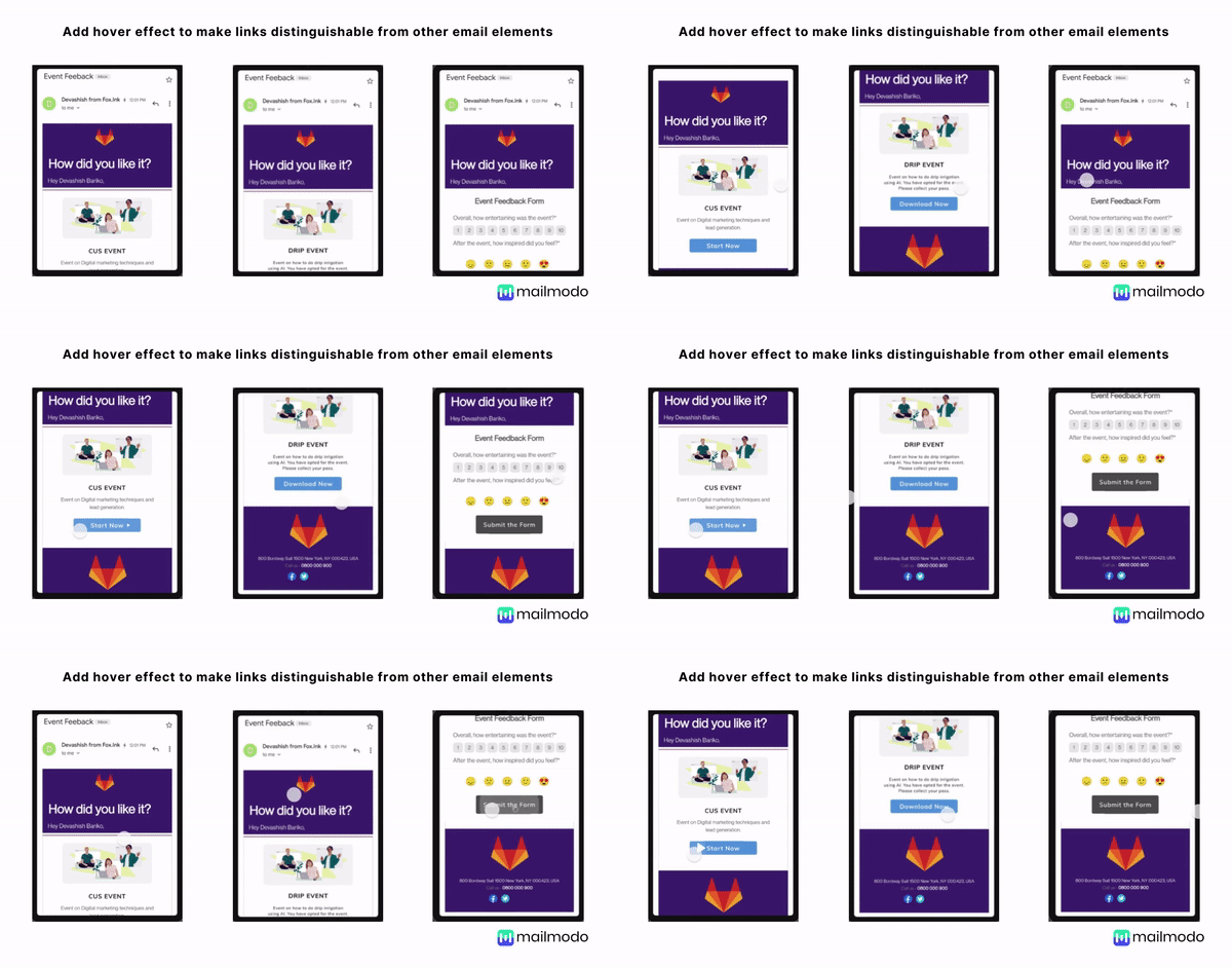
Always make clickable links, buttons different from the other email content. For example, even if you change the link color from the text, users with color blindness won’t recognize the difference.
To make links and buttons accessible, follow these guidelines:
Make clickable links and buttons bigger so that they are easy to identify.
Avoid “click here” or “learn more” as your CTA. Instead, use text such as ‘Read our AMP email guide.’
You can also add a hover effect using the: hover pseudo-selector. It helps in indicating that a link or button can be clicked.
8. Make emails responsive for different screens size
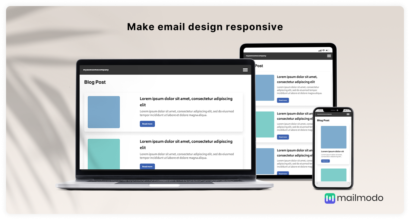
Some users might use mobile to read; others may use tablets and PCs. So, creating emails that fit all these screen sizes is crucial for better readability and engagement. Hence, make sure to adopt a responsive email design.
You can read our email design best practices article for an in-depth guide.
How to make email code accessible?
The code you use in creating email affects how easily assistive technology such as screen readers, keyboard navigation tools, read your emails. So, you should follow these best practices to create a more accessible email code:
9. Use semantic markup
Semantic markup means coding the email content using proper syntax rather than manipulating the code visually for the same visual rendering or effect.
For example,
<h1>This is a heading</h1>
< p><class style: bold, font-size:16>This is a heading</p>
It might produce the same effect, but the H1 tag ensures that the text is considered a heading. It helps screen readers to differentiate email elements such as paragraphs from the headlines. You can add these semantic markups for accessibility:
Maintain headline hierarchy by using heading tags
<h1>,<h2>,<h3>,<h4>,<h5>, and<h6>and put the email body within the<p>tag.Use
<strong>or<em>tags to tell screen readers the text is essential and should be emphasized.
10. Specify a language attribute
Having a language attribute tag in HTML is essential for subscribers using screen readers as it helps them know how to pronounce and read the email content.
Add <html lang="xx">, where 'xx' will be appropriate language code for your emails. For example, an English language attribute will look like this: <html lang="en">
11. Use role=”presentation” attribute on all 'Table' elements
By default, screen readers read out the <table> element and then go to the content within the table. It can be annoying as users have to go through many markups before getting to the actual content. So, it is essential to tell the screen reader that the table is for layout purposes only.
To do so, you can follow these guidelines:
- Add role=“presentation” to each table in your email. The screen reader can skip to the content, focusing on the semantic markup, such as rows or columns. The code will look like this:
<table role=”presentation” border=”0” cellpadding=“0” cellspacing=”0”></table>.
- If you’re using tables to create bulletproof buttons, include the button role to provide additional context for users that need it.
12. Write alternative descriptive text for images
Adding alt text for images is helpful for people using screen readers to help them know what the image is all about.
Besides, if images are blocked in an email client, users can still understand the image with alt text. Follow these practices while adding alt text for images:
Write different alt text for each image.
Write descriptive yet concise alt text that describes the image.
Style your alt text as it will look appealing rather than simple plain text. So, you can adjust the font size, font height, spacing, background color, and font color.
One step up - How to aim for more than just accessible emails?
After ensuring that your emails are accessible, it is also imperative that your users understand and comprehend your emails. That’s where readability comes in. So, here are best practices to make your email more readable and understandable.
• Keep your copy concise
Lengthy email copy can make it difficult for people with cognitive disabilities such as dyslexia to read properly. Long copies create a burden on the brain to process such vast information.
Thus, you should keep the email copy short and concise to make emails scannable and easy to read.
• Use shorter sentences
Breaking down longer sentences into smaller ones can improve the readability for everyone.
For example, sentence lengths of less than 80 characters are usually the easiest to read. In addition, you can use readability tools such as Hemingway editor to improve the readability and sentence length.
• Use synonyms with fewer syllables instead of ones with many syllables
Words with many syllabi need more concentration to comprehend their meaning. Thus, try to use synonyms with fewer syllabi. Some of the examples are:
Consolidate → combine, join, merge
Component → part
Encounter → meet
However → but
Provided that → if
• Localize your content for global audiences
You should translate the email content into your audience’s local language. Do not rely on the operating system or browser translation, as the translation may not be accurate. Moreover, go beyond translation and localize the email copies by using words and phrases native to your subscribers.
To know more, read our 11 email design best practices guide.
Few more actionable tips to make email accessible for all
Here are some more tips you can use to ensure email accessibility:
Make sure all functionality in your emails is usable with the keyboard. It is essential for users who use keyboards to access and move between links, buttons, forms, and other elements in emails.
Test your emails with people facing accessibility issues. Get their feedback and work on the problems.
Keep an open mind while understanding the conditions of your subscribers. Without this, you won’t be able to optimize emails for them.
Be empathetic and treat subscribers as humans rather than just numbers or leads.
Way forward
Creating accessible emails goes way beyond laws and higher ROI. It is about putting yourself in your subscriber’s shoes and creating emails to solve their problems.
Accessibility will be the factor that can help you stand out as a brand and shape the brand’s perception. And not just for your brand image, but it is the human thing to do. After all, if your subscribers can’t access your emails at the end of the day, what good are your emails then?
We, at Mailmodo, keep email accessibility at the core of our campaigns, and you should do the same. Email accessibility is not something you can negotiate with.

